#1 - How To: Blur a Fixed background Image w/ CSS
January 8, 2022

We've all been there, browsing a random site, and a new effect catches your eye. And if you're like me you think, "I wonder how they did that?" That's happened to me a few years ago with this effect. And when I wanted to implement it, it turned out to be a bit easier that I thought!
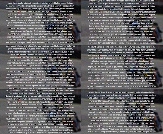
First let's define what we want: an image that is "locked" in the background while we have text scrolling above it. And for added effect, the background image should be blurred.
Next, the set up; we only need two divs to accomplish this, the image and the text content, for example:
<!-- Your HTML content -->
<div class="image"></div>
<div class="content">
	<p>Lorem ipsum dolor sit amet...</p>
</div>
And the most important part, the CSS!
.image {
  /* keeps image pinned to background */
  position: fixed;
  left: 0;
  right: 0;

  height: 100vh; /* image height to full viewport */
  z-index: 1; /* sets image behind content */

  /* background image and blur effect */
  background-image: url("https://s3-us-west-2.amazonaws.com/s.cdpn.io/181085/track_riders_bg01.jpg");
  filter: blur(5px);
}

.content {
  position: absolute;
  z-index: 2;
}
Now the explanation:
.image: Keep the image fixed and make it take up the full viewport height. Also set the z-index behind the text content.content: Set the z-index above the image, and set the position toabsoluteto keep this property working
Now, one last thing, the blur effect. This is easy to apply to any image through CSS by using the filter property like this filter: blur(5px);. You can use a bunch of different filter options too to style images on the browser, check out some more examples on MDN.
Aaaand that's it! If you want to see an example in action, check out my codepen example.